
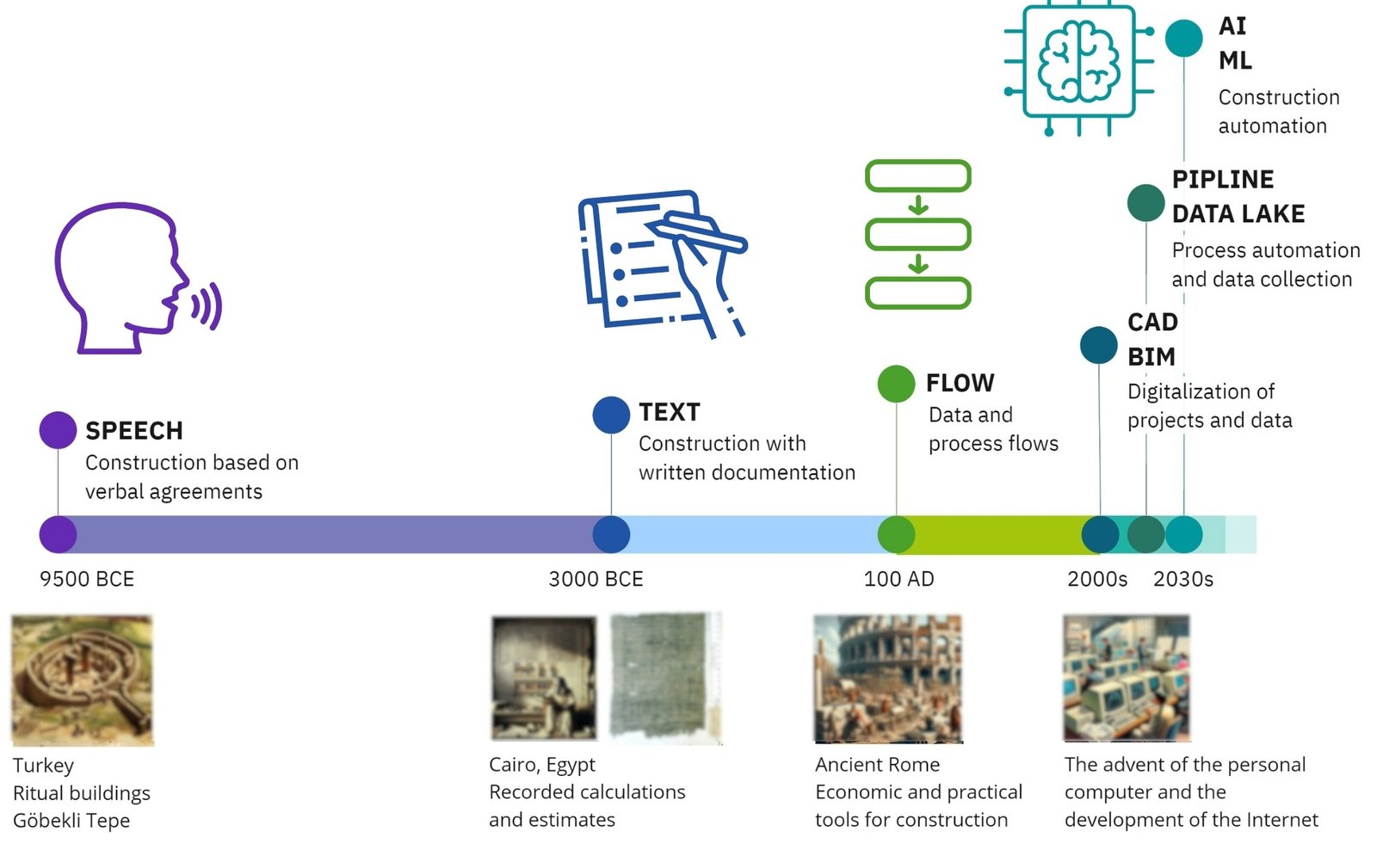
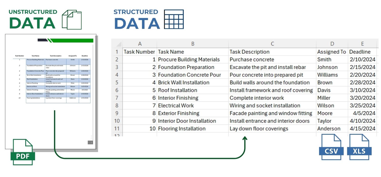
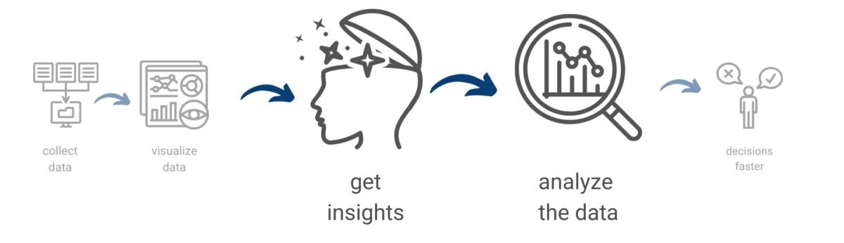
A variety of charts and graphs are used to visualize indicators and metrics, which are typically combined into data showcases and dashboards. These dashboards provide a centralized view of the status of a project or parts of a project, displaying key indicators (ideally in real time). Up-to-date and continuously updated dashboards allow the team to respond quickly to changes.
Dashboards are tools that visualize quantitative assessments, making them easily accessible and understandable to all project participants.

Here are some examples of popular tools in which you can create dashboards:
- Power BI is a tool from Microsoft for creating interactive reports and dashboards.
- Tableau and Google Data Studio are powerful tools for visualizing data and creating dashboards without having to write code.
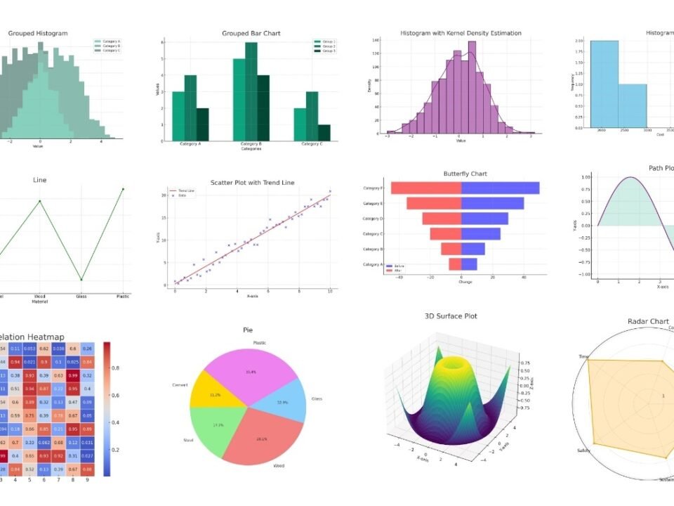
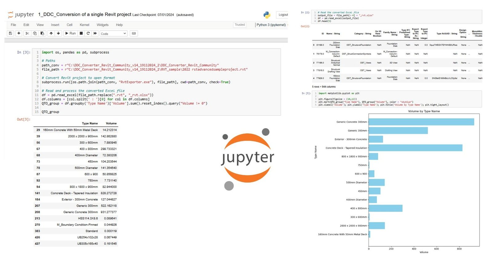
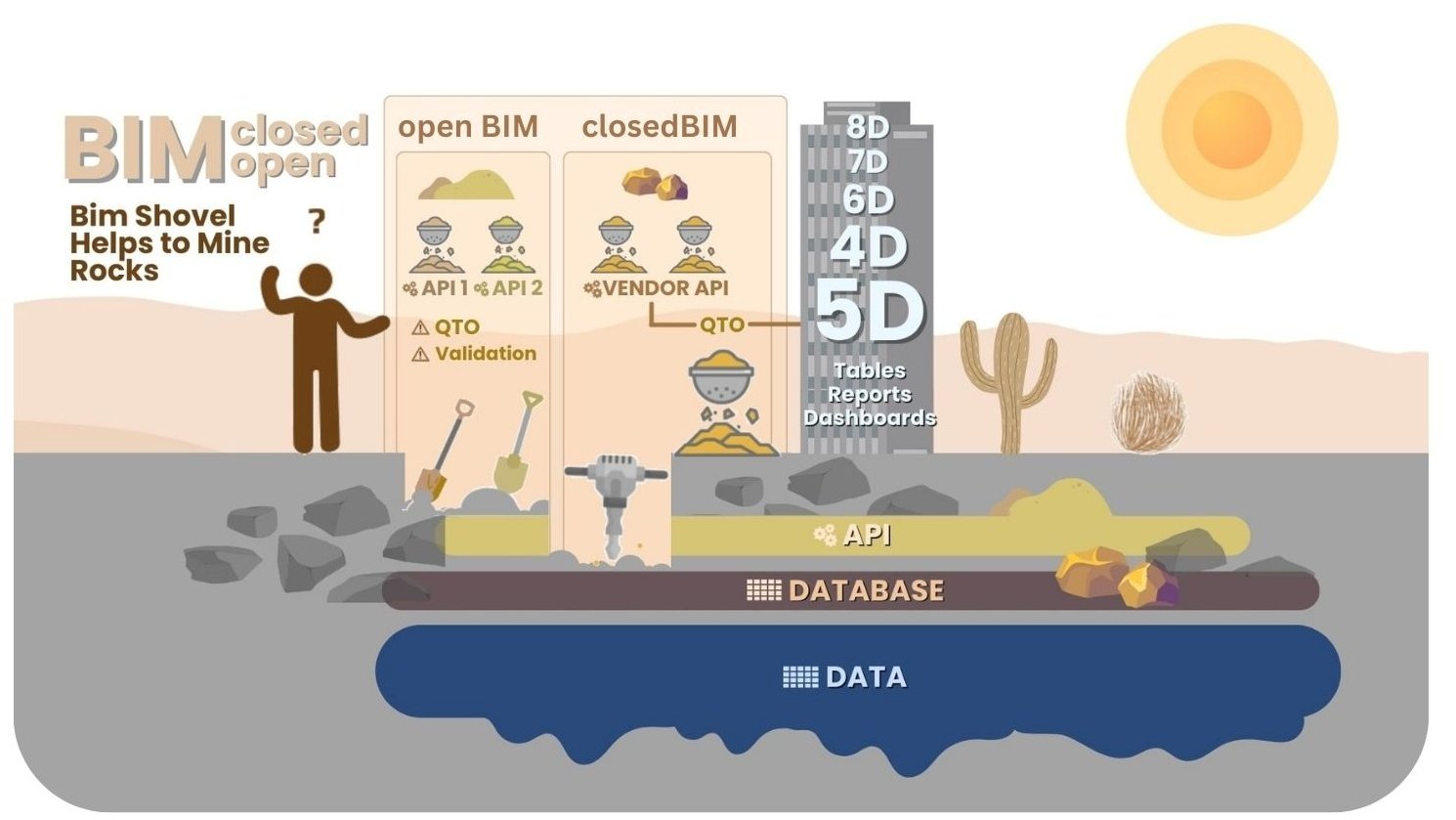
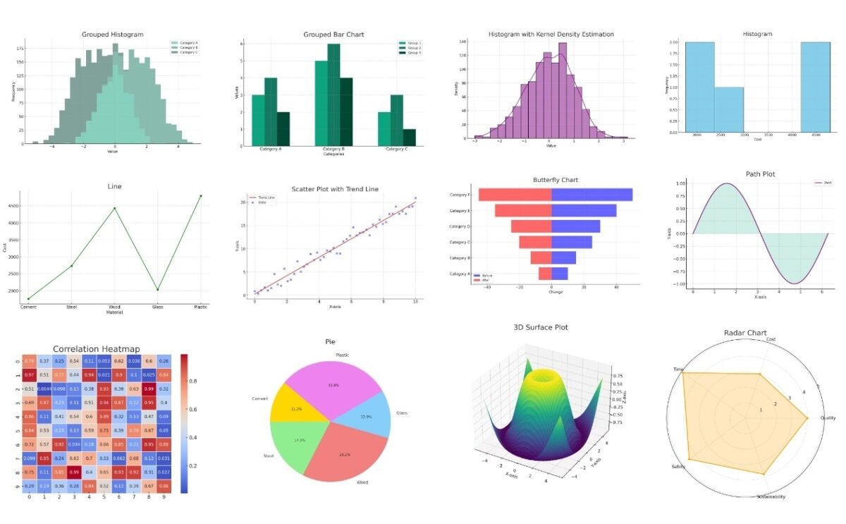
- Plotly (Fig. 7.1-6, Fig. 7.2-12) is a library for creating interactive graphs, and Dash is a framework for creating web applications for data analysis. They can be used in combination to create interactive dashboards.
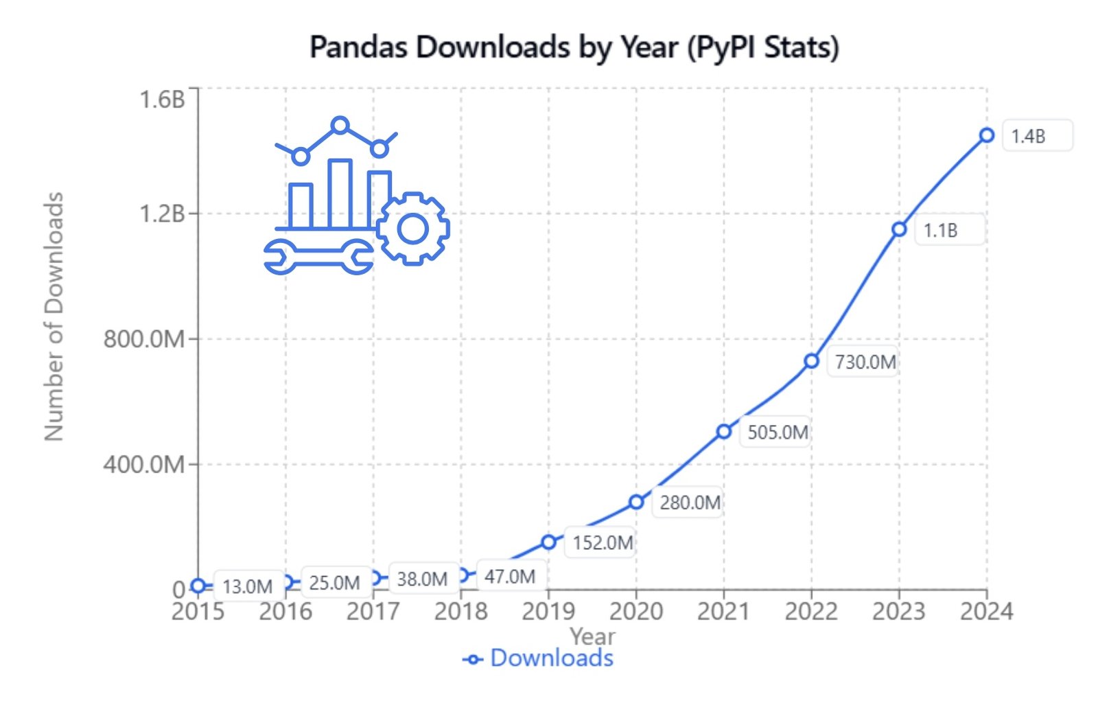
- Multiple Python libraries (Fig. 7.2-9 – Fig. 7.2-11) – Python has many open source and free libraries for data visualization, such as Matplotlib, Seaborn, Plotly, Bokeh and others. These can be used to create graphs and integrate them into a web application using frameworks such as Flask or Django.
- JavaScript Libraries: allow you to create interactive dashboards using Open Source JavaScript libraries such as D3.js or Chart.js and integrate them into a web application.
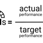
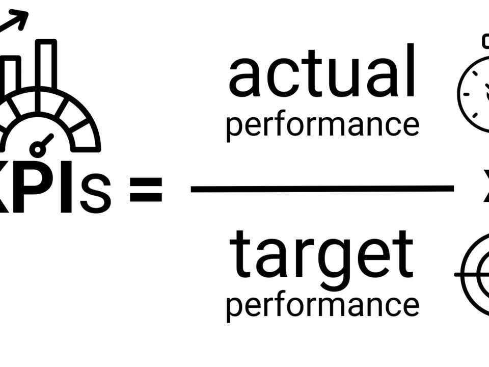
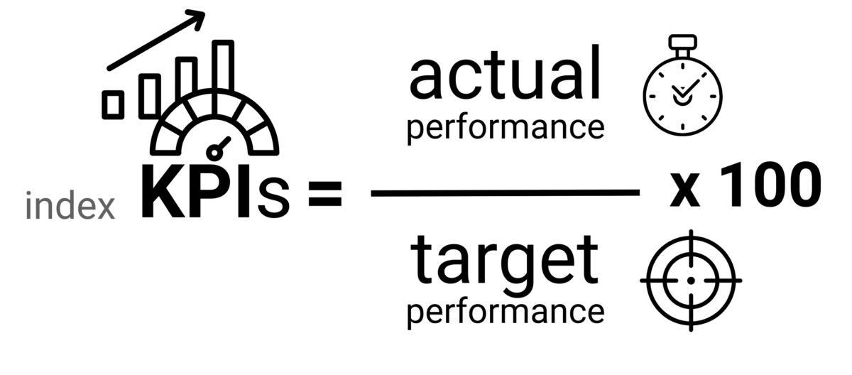
To evaluate KPIs and create dashboards, you need up-to-date data and a clear timeline for collecting and analyzing information.
In general, KPI, ROI and dashboards in the construction industry form the basis for an analytical approach to project management. They not only help to monitor and evaluate the current status, but also provide valuable insights for future planning and process optimization – processes that depend directly on interpreting data and asking the right and timely questions.


