
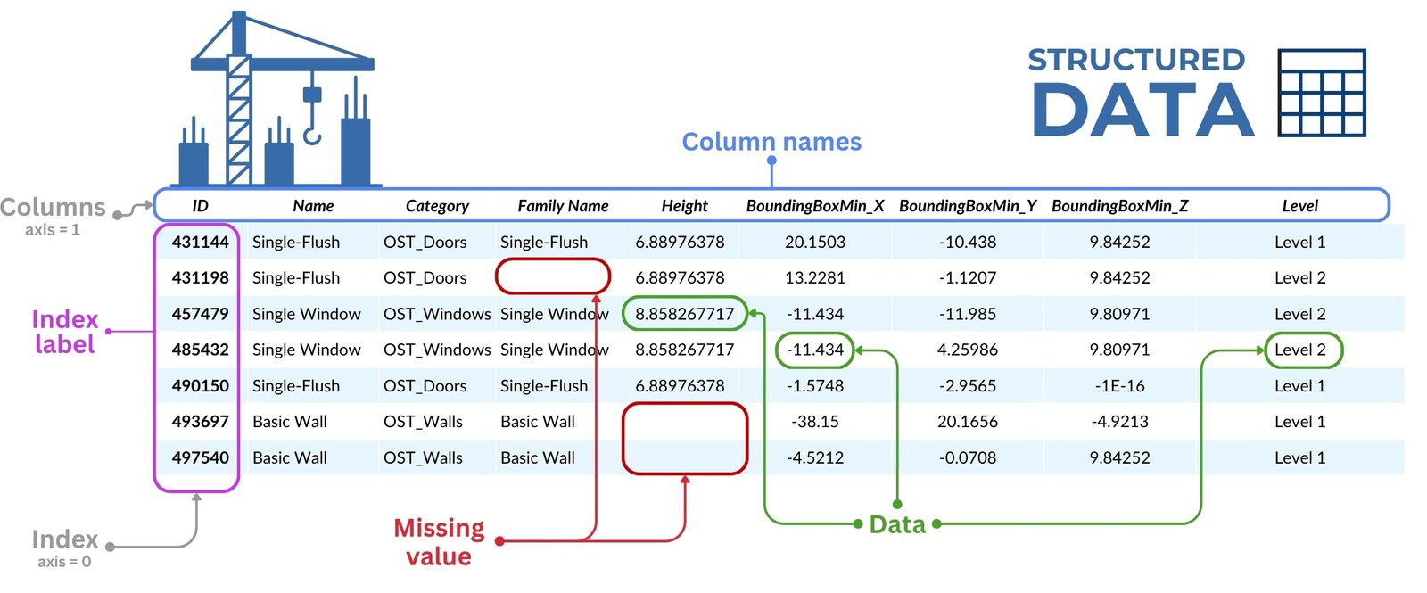
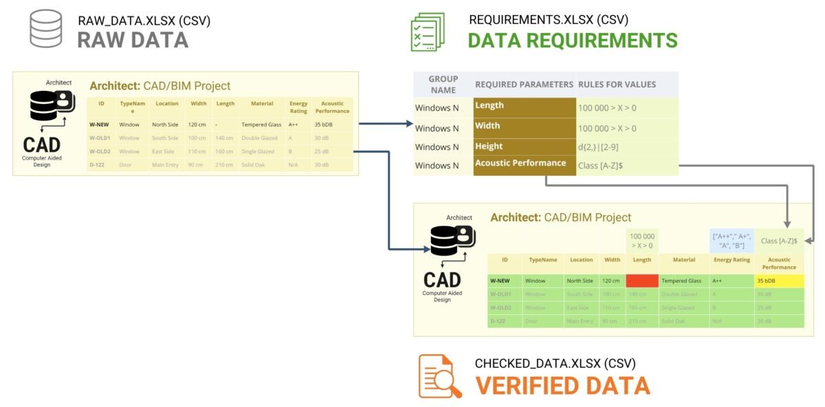
Visualization is an essential tool for interpreting inspection results. In addition to the usual summary tables, it can include dashboards, diagrams, and automatically generated PDF documents that group project elements by inspection status. Color coding can play a supporting role here: green can indicate items that have been successfully validated, yellow can indicate items that require additional attention, and red can indicate items that have critical errors or are missing key data.
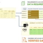
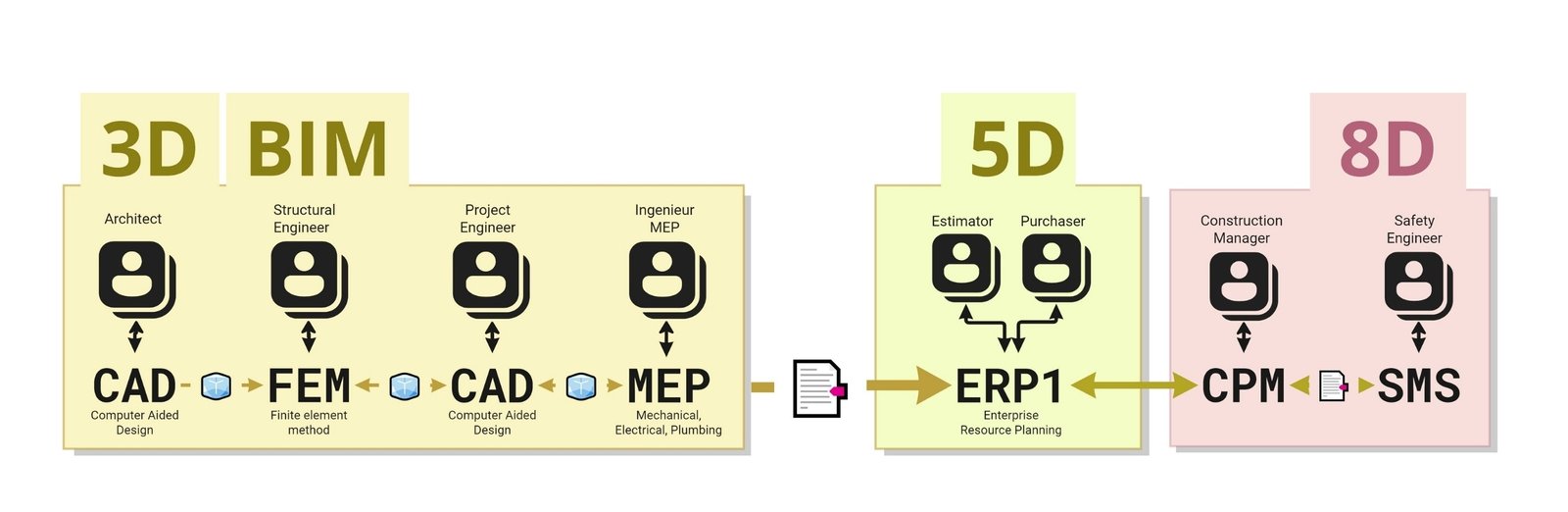
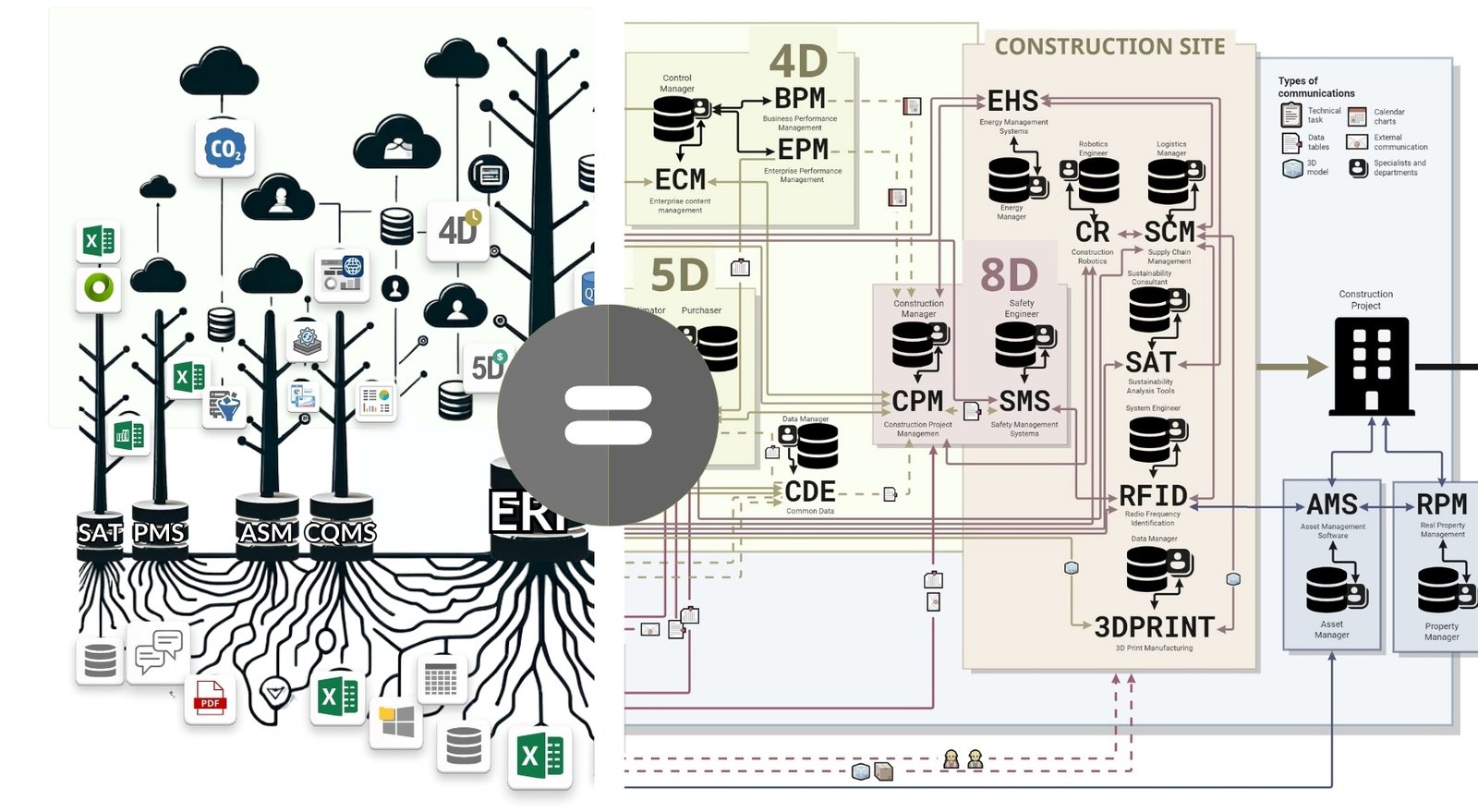
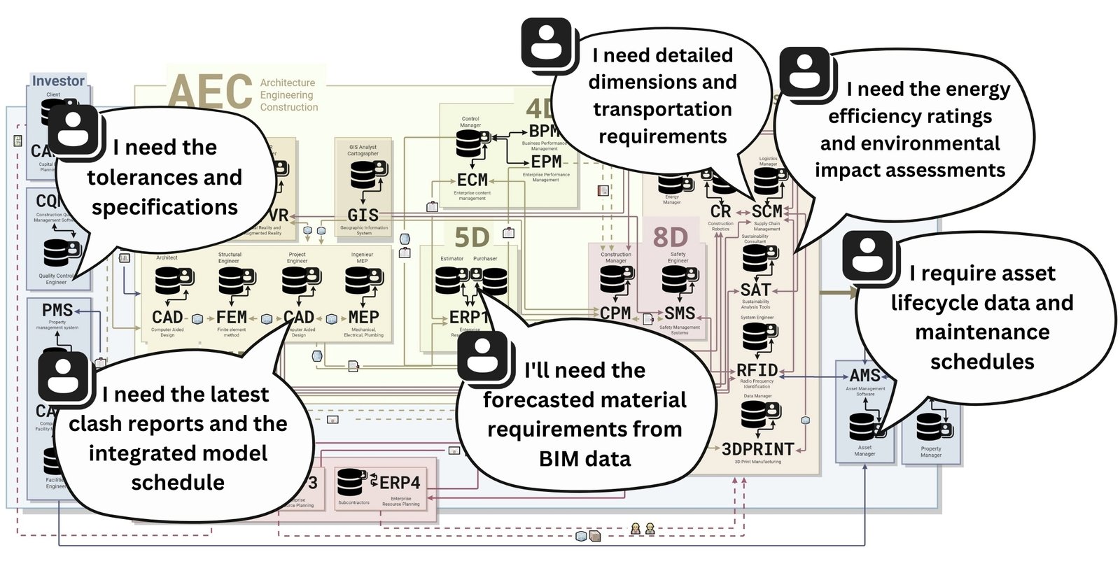
In our example (Fig. 4.4-1), we analyze data from each system step by step: from CAD (BIM) and real estate management to logistics and installation schedules (Fig. 4.4-16). Based on the audit results, individual alerts or report documents are automatically generated for each specialist, e.g. in PDF format (Fig. 4.4-17). If the data are correct, the specialist receives a brief message: “Thank you for working together”. If discrepancies are detected, a detailed report is sent with the wording: “This document lists elements, their identifiers, attributes and values that have not been checked for compliance”.

Thanks to the automated validation process – as soon as an error or data gap is detected, an instant notification is sent in the form of a chat message, e-mail or PDF -document to the person responsible for creating or processing the relevant entities and their attributes (Fig. 4.4-18), with a list of elements and attribute descriptions that failed the validation.

For example, if a document arrives in the property management system (after structuring) with the Warranty Period attribute incorrectly filled in, the property manager receives an alert with a list of attributes that need to be checked and corrected.
Similarly, any deficiencies in the installation schedule or logistics data will result in an automatic report being generated and, for example, a chat notification or an e-mail with the results of the inspection being sent to the relevant specialist.
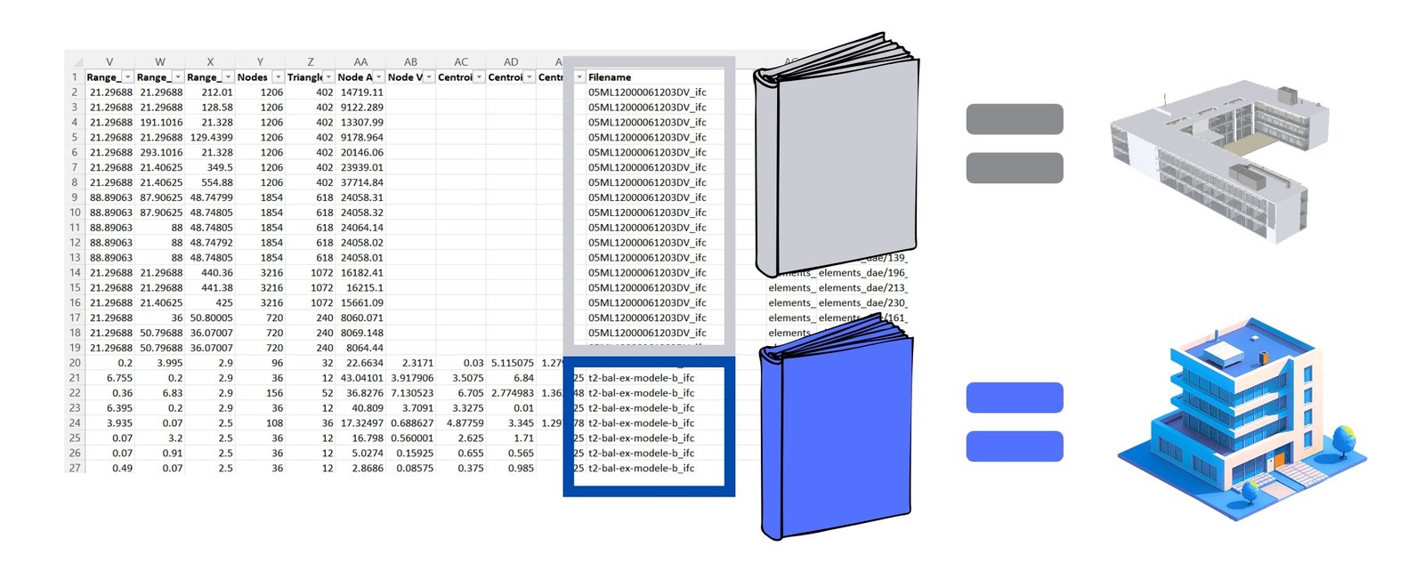
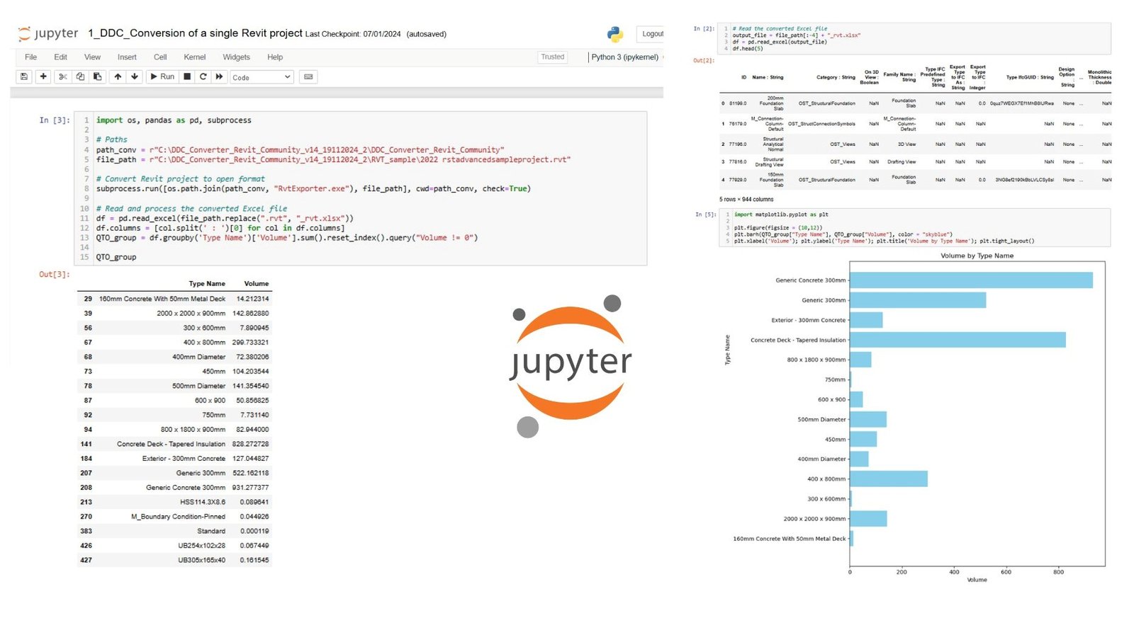
In addition to PDF -documents and graphs with results, it is possible to create dashboards and interactive 3D -models (Fig. 7.1-6, Fig. 7.2-12) highlighting elements with missing attributes, allowing users to visually utilize 3D element geometries to filter and evaluate the quality and completeness of these elements in the project.
Visualizing inspection results in the form of automatically generated documents, graphs or dashboards greatly simplifies data interpretation and facilitates effective communication between project participants.
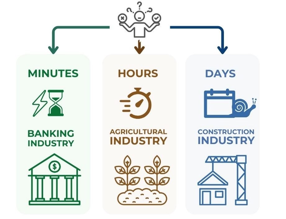
The process of automatically checking data from various systems and information sources can be compared to informed decision-making in everyday life. Just as companies in the construction industry consider many variables – from the reliability of input data to their impact on the timing, cost, and quality of project implementation – so too, when making important decisions, for example, when choosing a place to live, a person weighs a number of factors: transportation accessibility, infrastructure, cost, safety, and quality of life. All of these considerations form a system of criteria, on the basis of which the final decisions that make up our lives are made.


